Visual Analytics Examples
 |
 |
 |
|---|---|---|
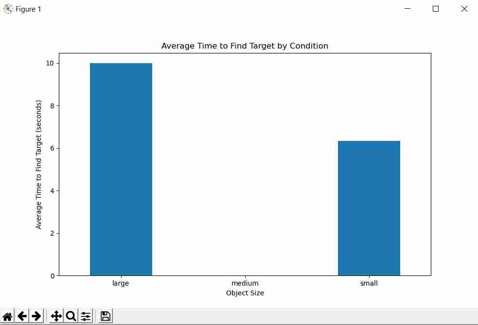
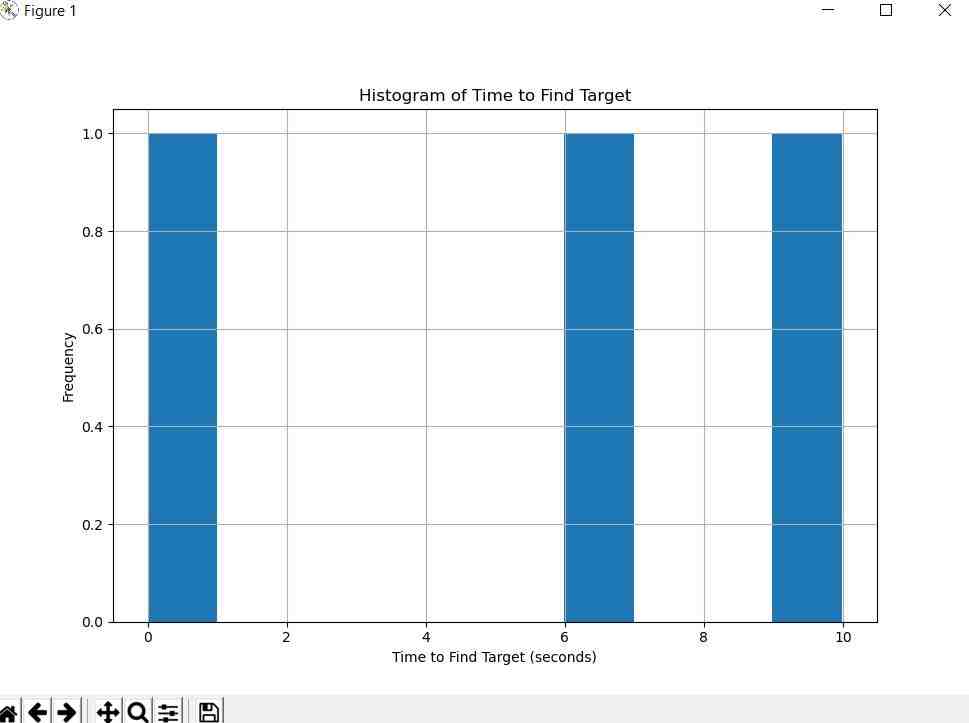
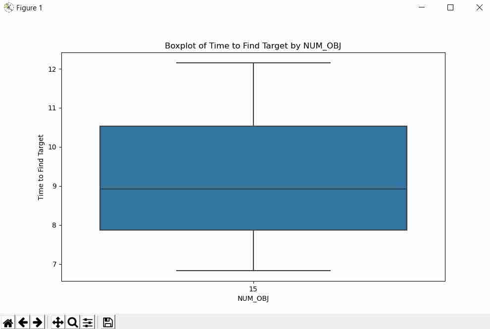
| Barchart | Histogram | Boxplot |
 |
 |
 |
|---|---|---|
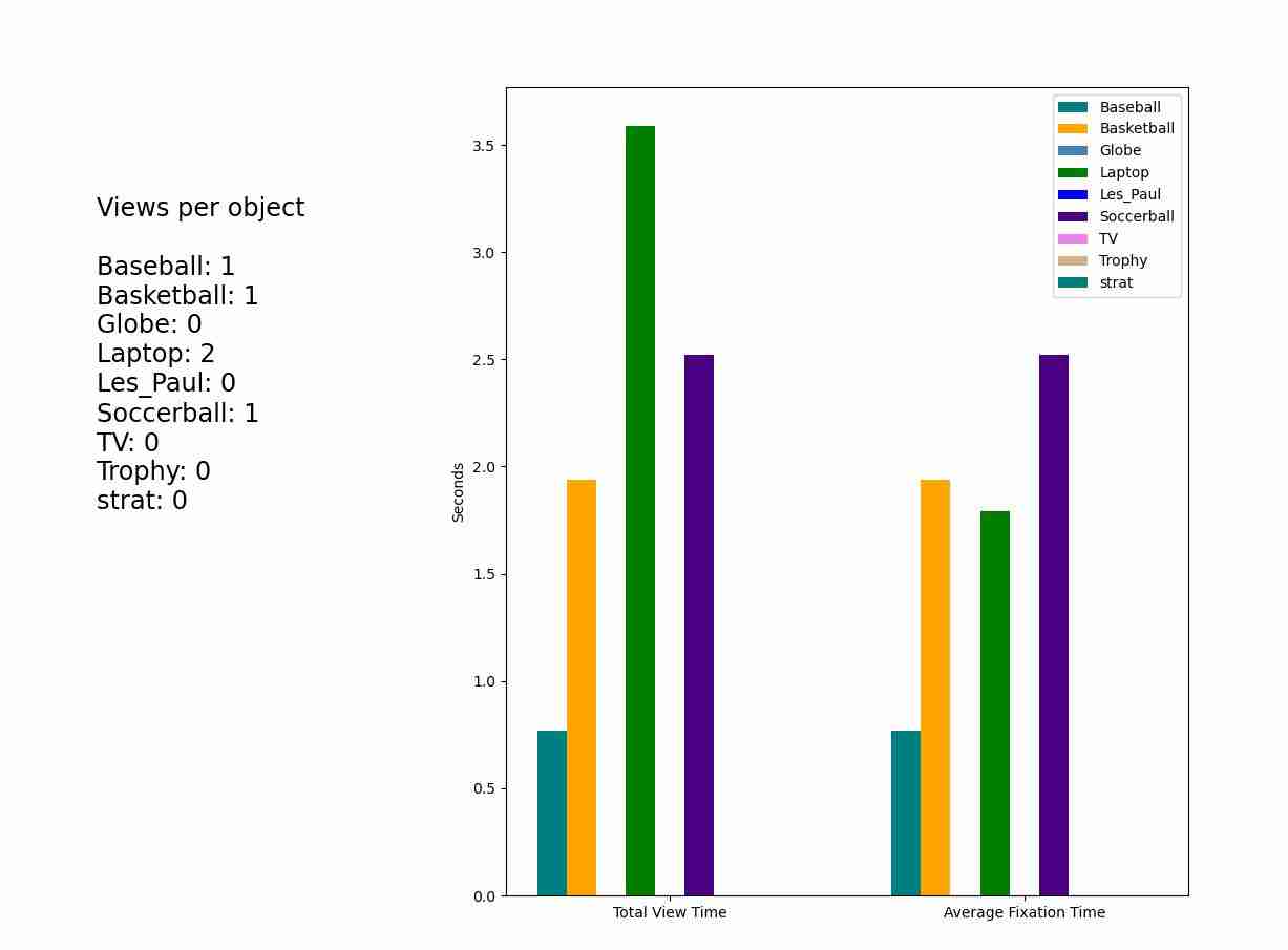
| Barchart Objects of Interest | Plotly Walk/Gaze Path | Real Time Data Plotting |
Generating Charts Directly from the Dashboard
The SightLab Dashboard has built-in tools for generating charts from your experiment data without writing any code. Open any project's detail page and click the 📊 Analysis button:
| Option | Description |
|---|---|
| ✨ Generate Visualizations… | Picks a SightLab experiment CSV and uses an AI model (Gemma, OpenAI, or Claude) to automatically generate a tailored set of charts — scatter plots, heatmaps, bar charts, and more — saved as PNGs in a Charts/ folder. When this starts it will open the data folder, the best file to select is the _experiment_summary.csv file. |
| 📊 Generate Barchart… | Reads a SightLab experiment CSV and instantly produces grouped bar charts (Total Dwell Time vs. Avg Dwell Time per ROI/Object) — no AI or API key required. |
The AI provider used by Generate Visualizations can be changed in the Dashboard Settings dialog. See the Dashboard documentation for setup details.
Some Available Tools
- Barchart
- Histogram
- Boxplot
- Plotly Walk Path
- Plotly Head and Gaze
- Plotly Barchart
- Heatmaps
- Realtime Data Plotting
Getting Started
- See ExampleScripts/VisualizationTools, VisualSearch task examples, or BarChart example for reference.
- Required libraries:
- Numpy
- Matplotlib
- Seaborn
- Pandas
- Plotly
- PyQt5 (for automatic chart display)
- Scipy and plyfile (for heatmap examples)
To add a Python Library to Vizard, use Tools > Package Manager.
Comprehensive Visualization Resources
Additional Analysis Tools
In addition to Session Replay, video recordings, tracking data, and experiment summary files (both included and custom), you can use Biopac Acqknowledge and other third-party tools for data analysis.
Specific Examples
Barchart for Gaze Data
See ExampleScripts/Barchart example for a matplotlib barchart showing gaze data on objects of interest.
Barcharts and Histograms
barchart_histogram.py: Load one of the experiment_summary data files and compare a condition and measurement (default "Label" and "Fixation Count")barchart_histogram_entireFolder.py: Load all files within the data folder and compare a condition and measurementcomparison_label_TTFF.py: Compare a condition and a measurement (default: "Label" column and Time to First Fixation)
Boxplot
See boxPlot_2_by_3.py for generating a box plot comparing 2 independent variables' association with 2 dependent variables.
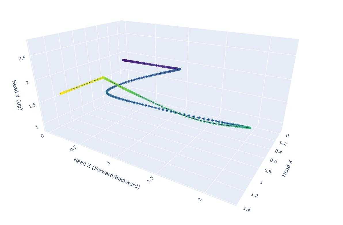
Plotly Visualizations
- Head position path
- Gaze path
- Barchart of views
- Walk path for all trials within a folder
Customizing Visualizations
To add or modify visualizations, adjust the code between where it loads "data" or "df" and where it saves the file at the end.
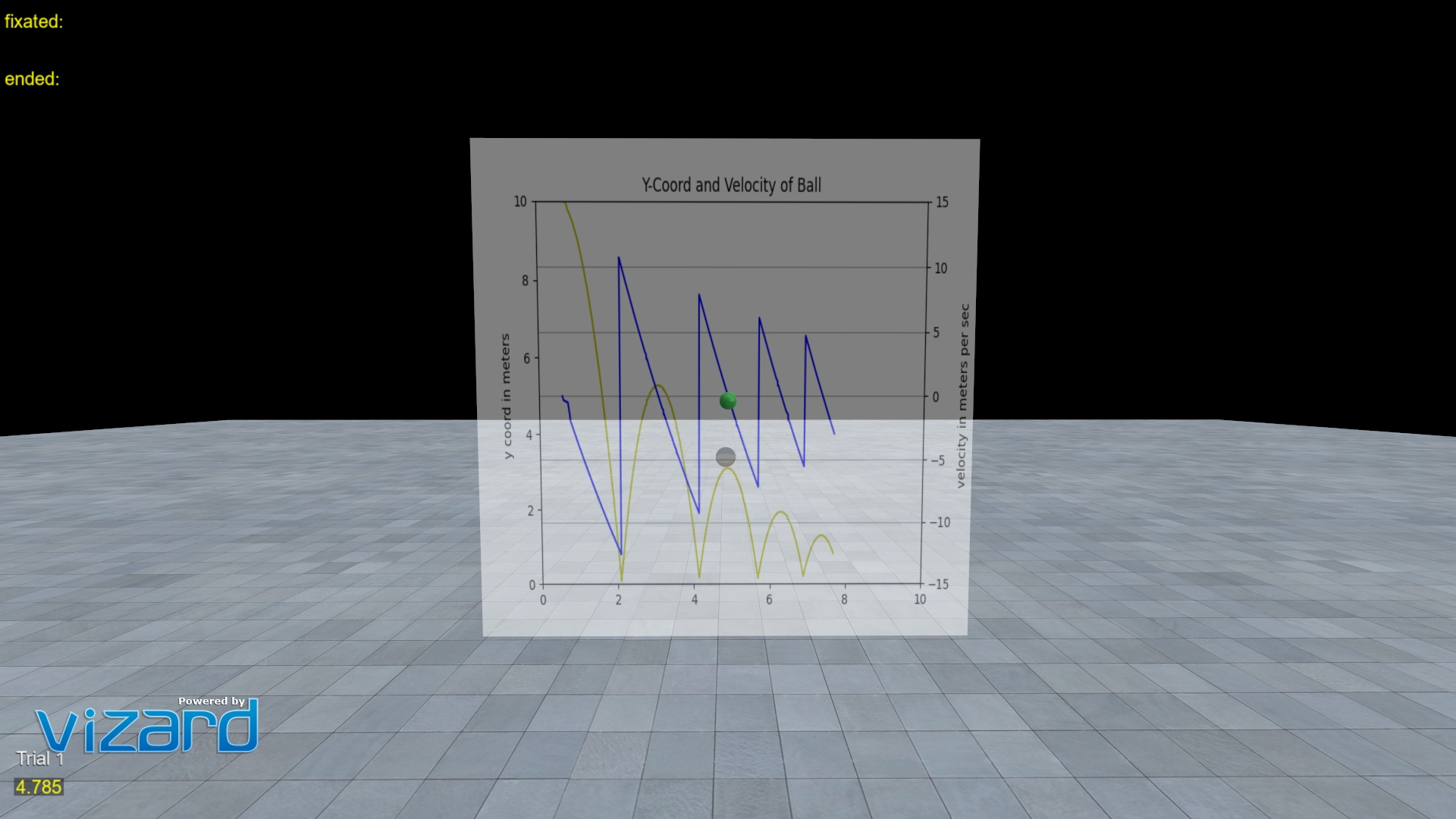
Real Time Data Plotting
Run SightLab_VR_MatPlotLib_RealTime to view a real time data plot of a ball bounding using MatPlotLib
Using LLMs for Visualization
- The ✨ Generate Visualizations option in the Dashboard lets you use a local Gemma model (via Ollama), OpenAI, or Anthropic Claude to automatically generate charts from any SightLab CSV — no manual prompting needed.
- You can also upload your
.csvfiles directly to LLMs like ChatGPT for custom analysis and visualization suggestions. - Any of your data files can be loaded into current LLM models for further analysis.